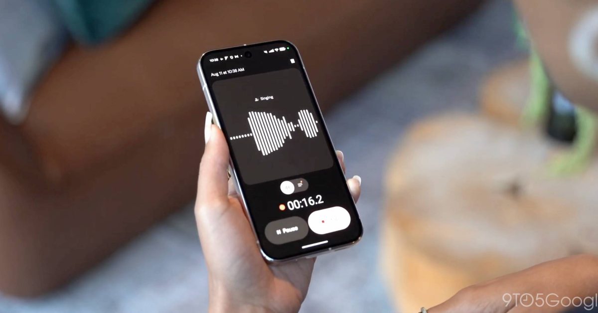
Google is rolling out a Material 3 Expressive redesign that tries to really simplify Pixel Recorder. It comes as the Pixel 10 series debuts a new music creator.
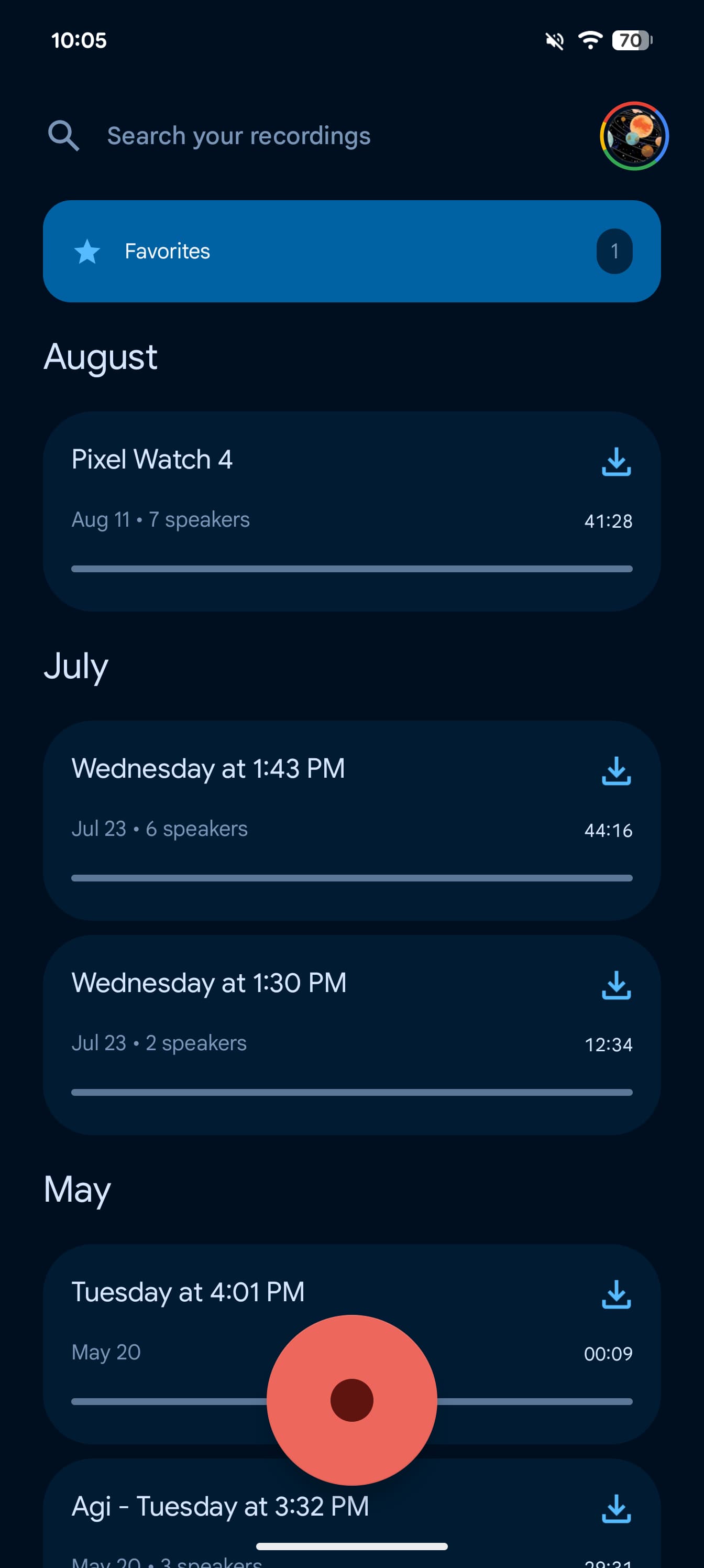
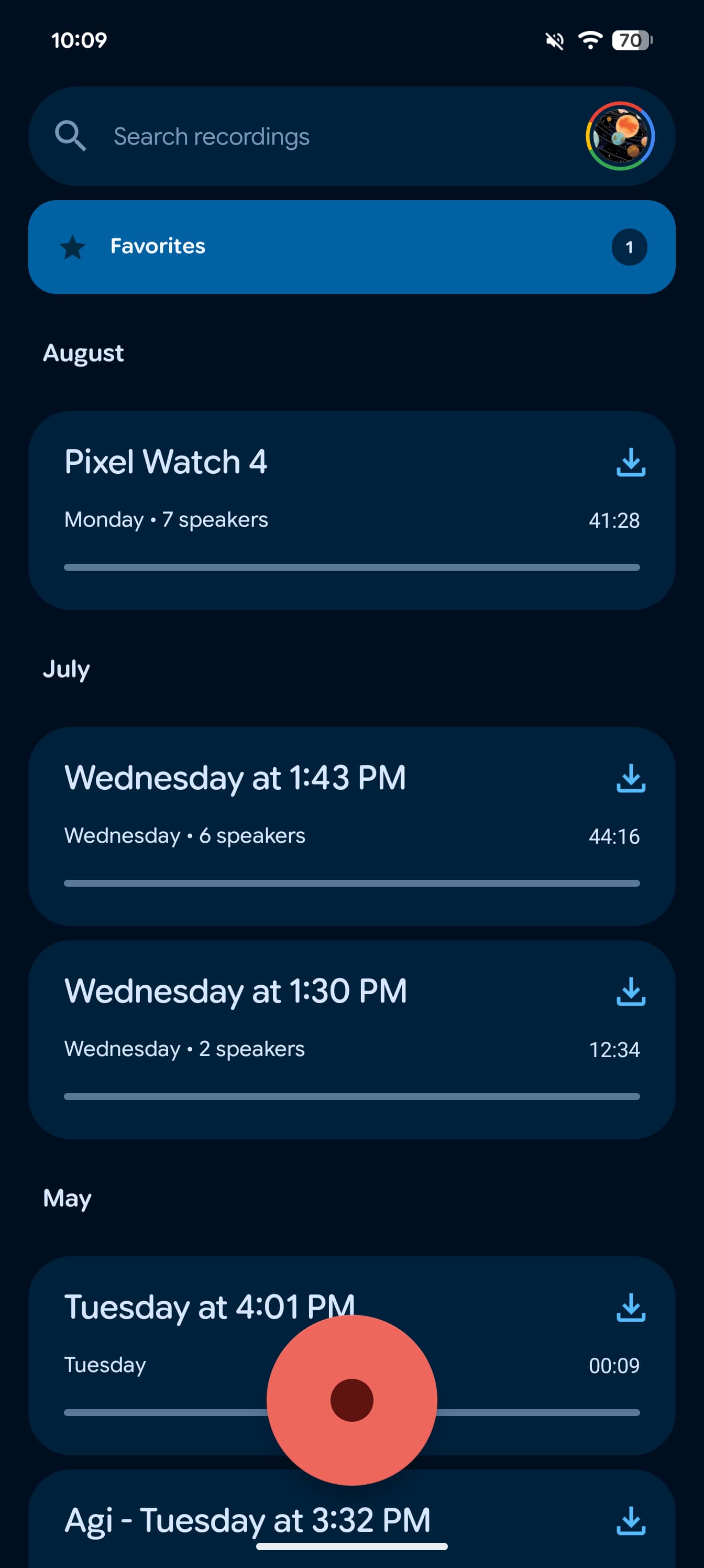
On the homepage, Recorder now has a pill-shaped “Search recordings” field, while font sizing and colors have been tweaked.
Old vs. new
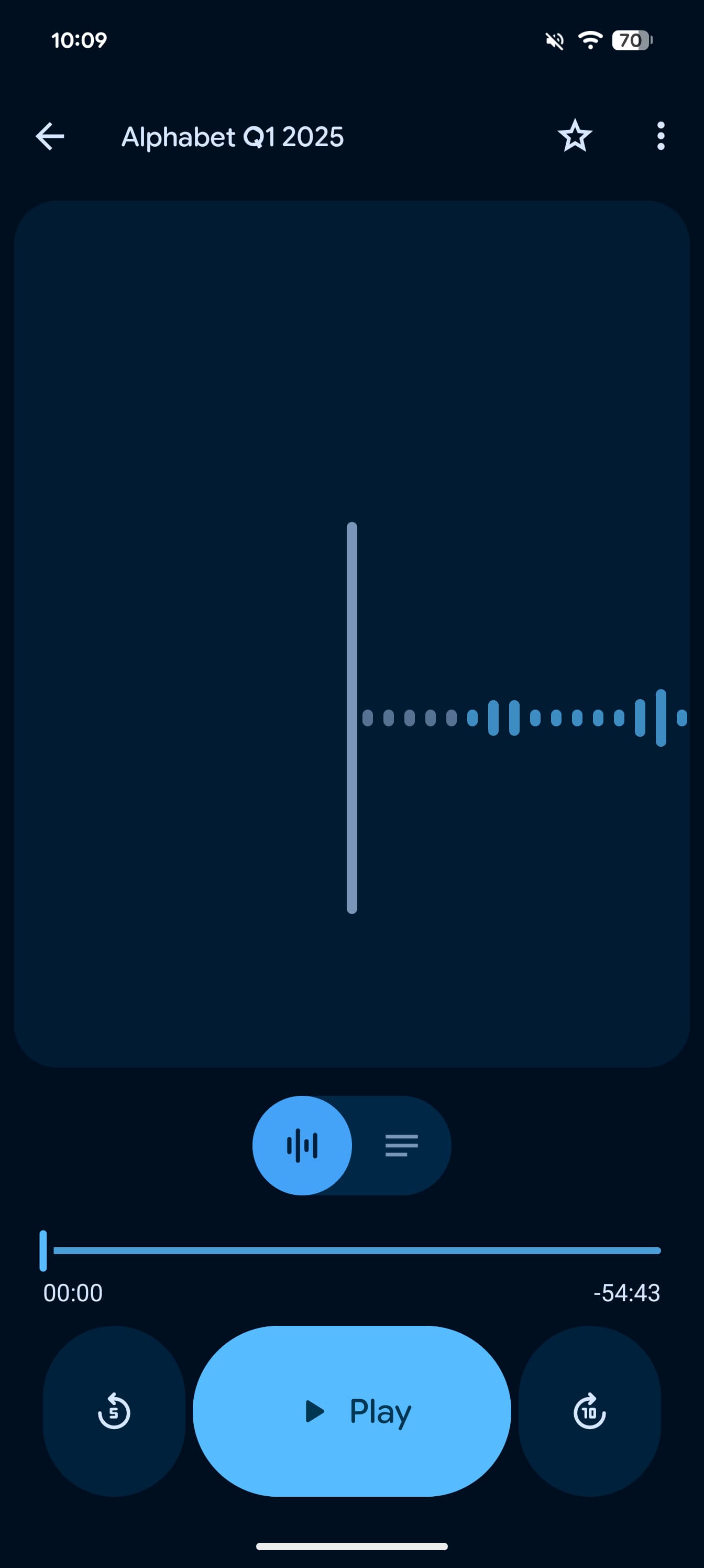
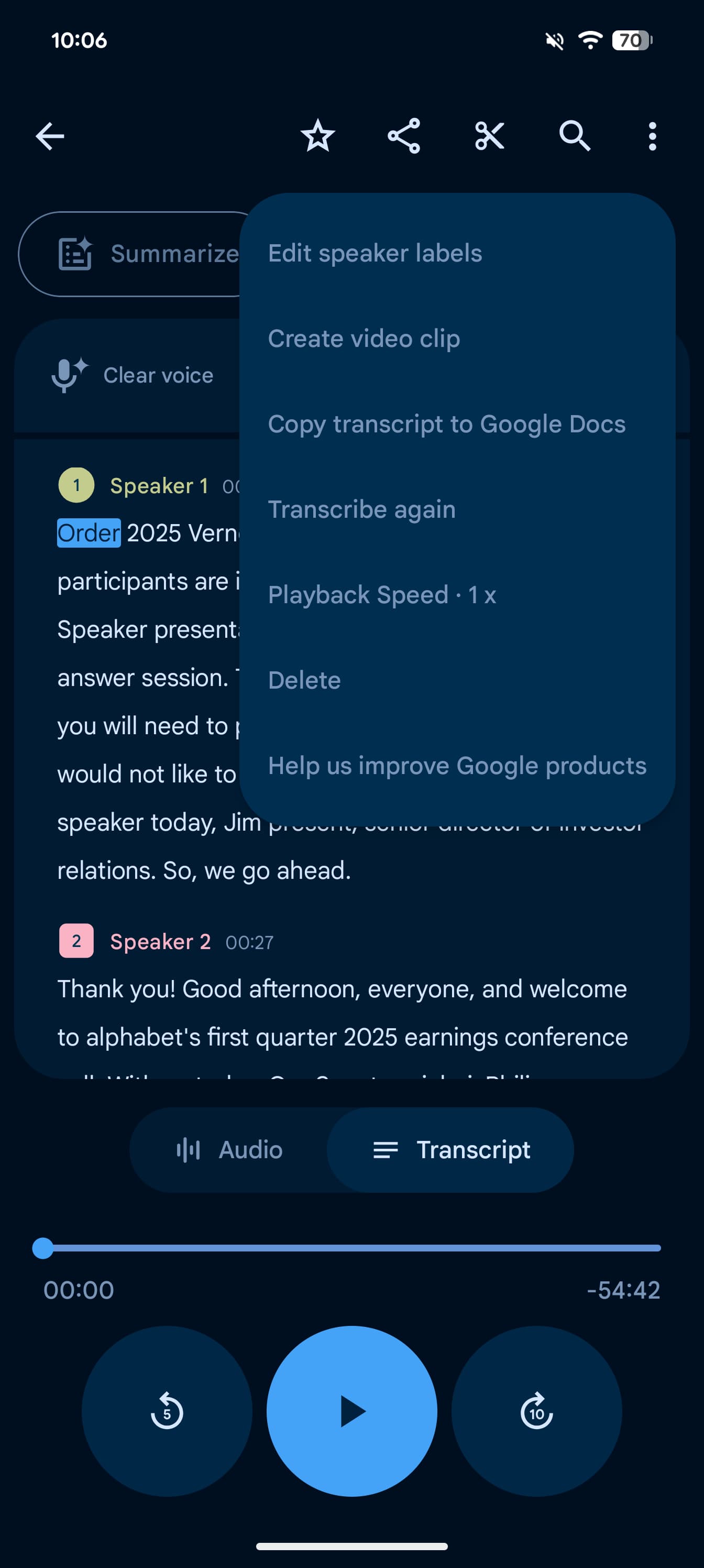
The simplification starts in recordings, with an oblong “Play” or rectangular “Pause” flanked by vertical pills for 5-second rewind/forward. Above that is an updated Material 3 slider, while the “Audio” and “Transcript” text labels are gone. The waveform is much thicker than before.
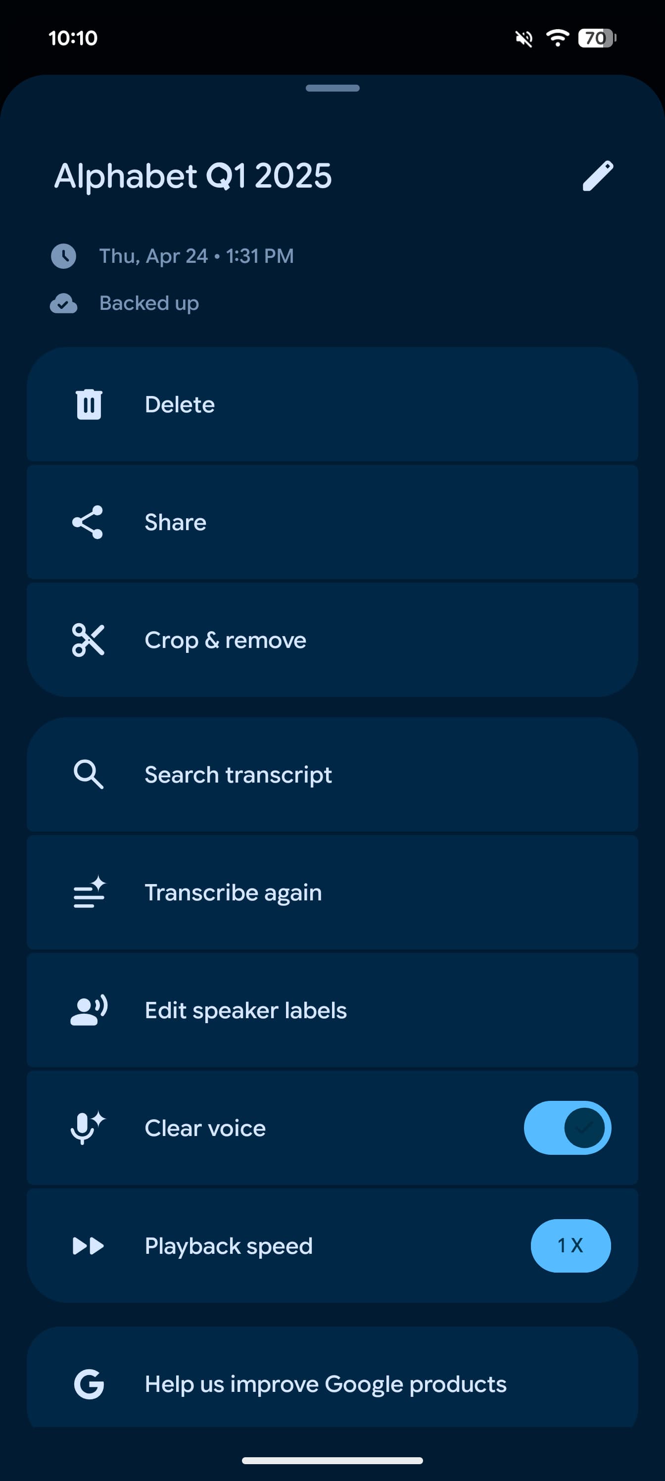
The app bar now just has the recording name, a star for favoriting, and a three-dot icon. That overflow opens a sheet where Pixel Recorder now places every other action.
After the date, time, Backed up status, you get high-level actions to Delete, Share, and Crop & remove. The next grouping has Search transcript, Transcribe again, Edit speaker labels, Clear voice, and Playback speed. “Help us improve Google products” rounds things out, with containers used throughout.
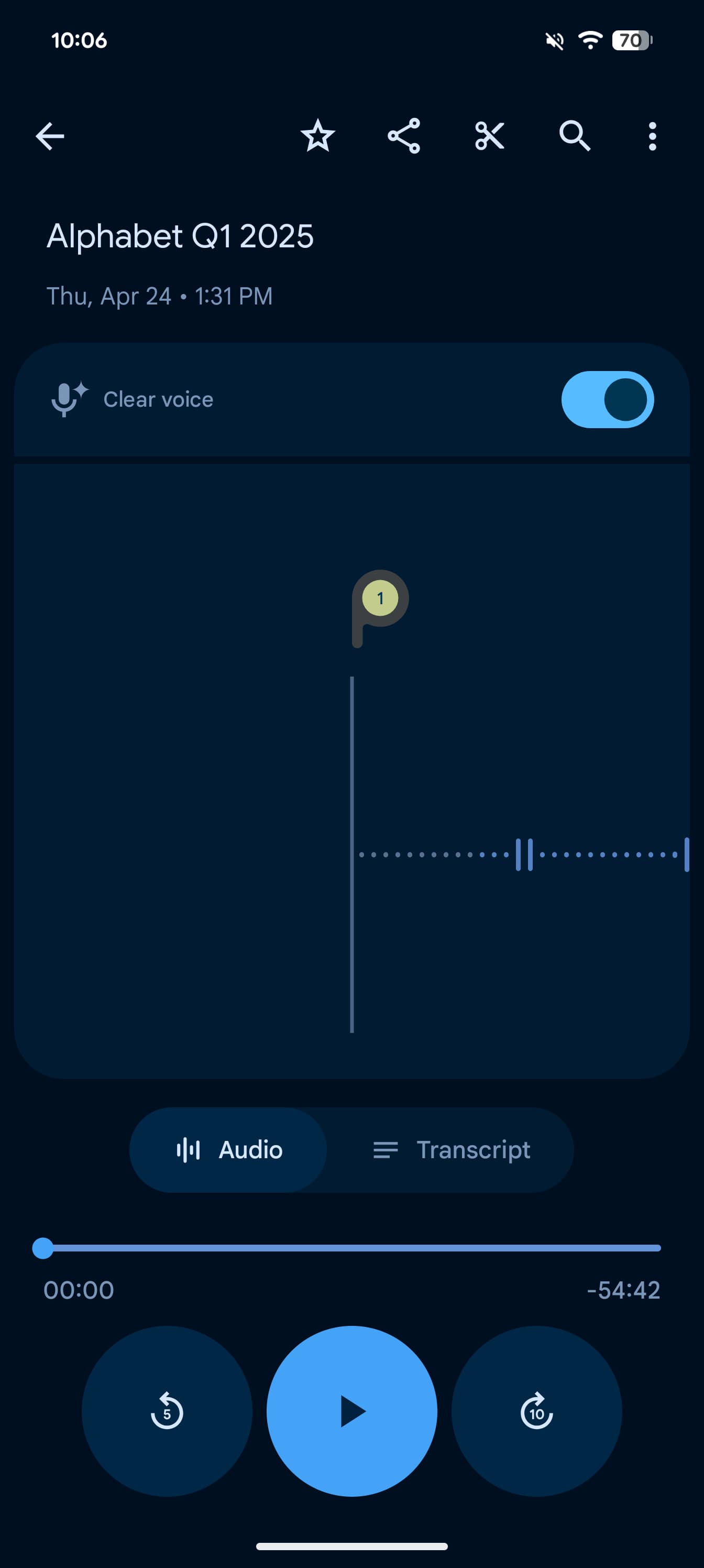
I can see how the previous row of five side-by-side icons might have been too much. This move does simplify the main page, but having to go to an overflow menu for search seems like an oversimplification.
Meanwhile, the recording interface gets a similar treatment with large “Pause” and “Stop” pills. The latter button replaces “Save” and immediately takes you back to the homepage to start backing up, while “Delete” is now a trash icon in the top-right corner.
Pixel Recorder 4.2.20250529.x with Material 3 Expressive is rolling out now via Google Play.
More on Material 3 Expressive:
FTC: We use income earning auto affiliate links. More.
