Jump Links
-
Where Perplexity hits a wall
When diving into design, I usually piece together the process through a messy combo of tutorials, forums, and just trial-and-error inside the graphics tool itself. Discovery is one of the most fun parts, especially when you end up with something that kind of looks like what you were going for. But the flip side is how scattered the process can become.
This is where Perplexity stepped in for me. My colleagues have seen great results by pairing the AI with productivity tools, and I thought, why not try it with graphics? So I tried using it as a design guide — not to design for me but to structure the process. It streamlined a lot of the process, but I also ran into a couple of snags. I’m doing this with my top tools, Krita and Figma, though you can try a similar process with any creative app.
Setting up Perplexity
Tuning the AI to my workflow
The first thing I learned about using Perplexity for design is that it isn’t just about typing a random question. The way you set it up and structure your threads actually changes the kind of answers you’ll get. Perplexity has contextual memory, so it can personalize the answers based on the information you give it and what it’s learned from your previous queries. For reference, I’m using the free version, so many of the customizations are paywalled to me.
I’ve already written about pairing Perplexity with Figma to help me learn some of the more complicated aspects of the tool. But now, I also had to incorporate Krita and my overarching design workflow. I started by revisiting the Personalization section in the account settings to ensure all my information and objectives were clear. Because Perplexity learns from your questions within every thread, I created new threads for each tool and another one for a general workflow.
Before starting to design, I asked a couple of questions in each thread to “train” the AI. Very general stuff, like the basics of drawing in Krita. This was just to get the AI attuned to what I’m looking for moving forward.
Getting design guidance
It streamlined the process
Whether I was using Figma, Krita, or whatever else, wasn’t quite the point. It was more about how I could use Perplexity as an extension of my design brain. So instead of treating it like a search bar, I build ongoing threads where my prompts layer together things like style exploration, references, and “how would I do this here” advice. In my workflow thread, I’d enter prompts like:
What are the design differences between a modern editorial layout, and a minimalist one?
What visual cues make something feel trustworthy in meditation apps?
This was just to get a landscape of the things I wanted to design. Something that immediately caught my eye in one of the answers was “rounded edges and natural imagery”. This was a great starting point for me.
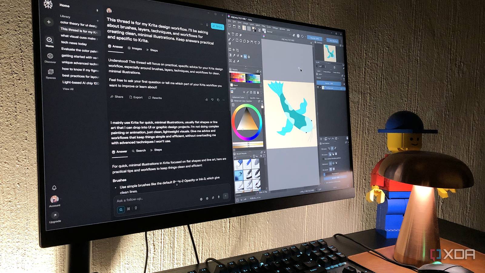
In Krita, I wanted to create a simple fish illustration — this is the “natural imagery” part. I already know the basics of the app, so I used Perplexity as a sparring partner. Here was one of my prompts for elaborating on my fish design in the Krita thread:
What’s a stylized way to depict fish fins without going hyperrealistic?
After creating an okay-looking fish, it was time to transfer my Krita asset to Figma and attempt to create a minimal and relaxing mobile UI. I had no idea how to incorporate my fish design into a mobile layout, so it was time to go back to the workflow thread:
Suggest ways to integrate a fish illustration into a mobile UI so it complements the layout without overwhelming usability, including placement, size, and color.
Perplexity delivered exactly what I needed, so I went to work trying to find the best placement for my illustration on this mobile layout. This is also where things like “rounded corners” came into play for adding shapes. I kept iterating on this layout design and referred back to my threads whenever I needed some advice.
What I loved about using Perplexity this way was that it cut down on decision fatigue and helped me jump right into the next step. Plus, the Images section in the results is especially helpful for design-related prompts.
Where Perplexity hits a wall
The AI has blind spots
Even though I’d been following Perplexity’s guidance for my designs, it still doesn’t have all the context. The AI can suggest things like calming colors and rounded corners, but it didn’t take into account that my fish illustration had many lines and edges, which didn’t make for the most relaxing or minimal visual. Despite detailing my issue in a prompt with the image file attached, it kept recommending minimalist design techniques that clashed with the illustration’s complexity. This meant the background of the layout was popping a bit more than it should have.
When it comes to pairing AI with creative work, it can’t see your design. It can only interpret the prompts and defaults to patterns it knows. It takes a human eye to recognize when a design is suitable for the style you’re going for — turns out, mine wasn’t. Ultimately, the solution was to create a more minimal fish illustration from the start.
Using Perplexity for graphics work is great… up to a point
I’ve concluded that Perplexity is great for helping you learn or navigate a design tool, and also for foundational design principles, advice, inspiration, and workflow structure. This information already exists; Perplexity pulls that data from real-time web searches and its proprietary search index, and then structures it in a way that makes sense. But it doesn’t actually understand the design you’re working on (unless you craft an extremely detailed prompt that describes every facet, as well as how the human mind interprets it).
I’d still recommend pairing Perplexity with your design workflow. It’s great for things like color palette ideas and design tool shortcuts. But you need to apply your human eye to get good results.