Slideshare, one of the internet’s original knowledge-sharing sites, has unveiled its first major redesign in nearly two decades. Part of Scribd, Inc., the reimagined Slideshare has been transformed in collaboration with independent branding and design studio Mother Design, pairing a modern identity with a growing suite of AI-powered tools for its global community of 70M monthly users.
The redesign marks the start of a new chapter for Slideshare, reflecting its ambition to reclaim its role as a modern, relevant tool for global knowledge sharing. While the platform has ambitious product plans, its brand had become disconnected from the expectations of today’s digital users. Scribd, Inc. partnered with Mother Design to create a new identity that would invigorate the brand, make it relevant for today’s audiences and differentiate it from its sister platforms.
The Slideshare rebrand is the third collaboration between Scribd, Inc. and Mother Design, following the creation of Everand in 2023 and the rebrand of Scribd earlier this year.
At the heart of Slideshare’s new brand world is the idea of ‘Never start with a blank page’. Presentations can feel daunting, but the brand’s role is to connect the world’s thinkers and empower the thought leader in everyone.
The rebrand includes a full design and identity overhaul to reflect a more intentional aesthetic. The new look of the identity is warm, bright, eye-catching but also down to earth. It balances the feeling of professionalism and reassurance with inspiring encouragement. The design directly references the outline of slide shapes in its logo as well as its graphic expression, and uses language that gets straight to the heart of the high and lows, stresses and successes of creating presentations. This focuses the identity around its core offering as a way to create instant cognition and recognition in a world of potentially ambiguous tech platforms.
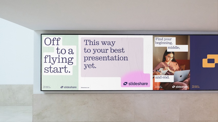
The colour palette is centred around a navy foundation, with confident orange accents and neutrals of white and off-black. A secondary palette inspired by Post-It notes builds a sense of ease and versatility. This combination brings authority and energy, while nodding to Slideshare’s original blue and orange to maintain a connection to its heritage.
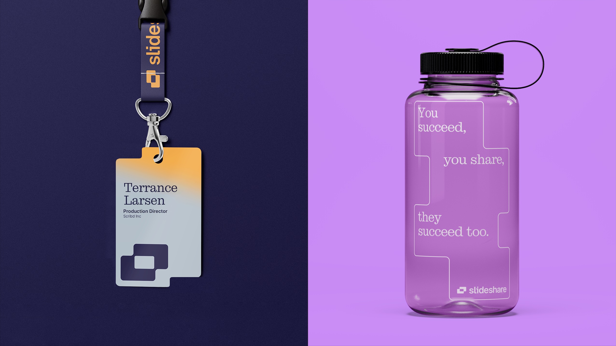
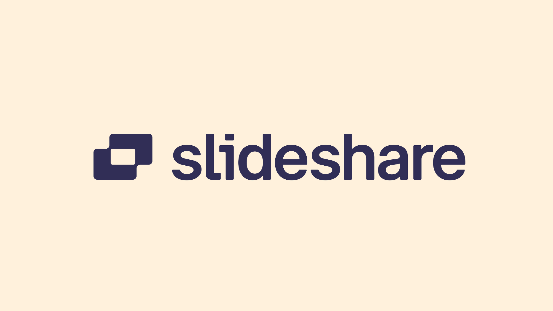
The new logo symbolises creation and possibility by combining two overlapping slides with a slide-shaped negative space at its centre. The logo wordmark is approachable and confident, conveying the product’s strength and utility in a welcoming and accessible way. It features a modified interlocking ‘l’ and ‘i’, speaking to the sharing of ideas and mirroring the slide device found throughout the brand world.
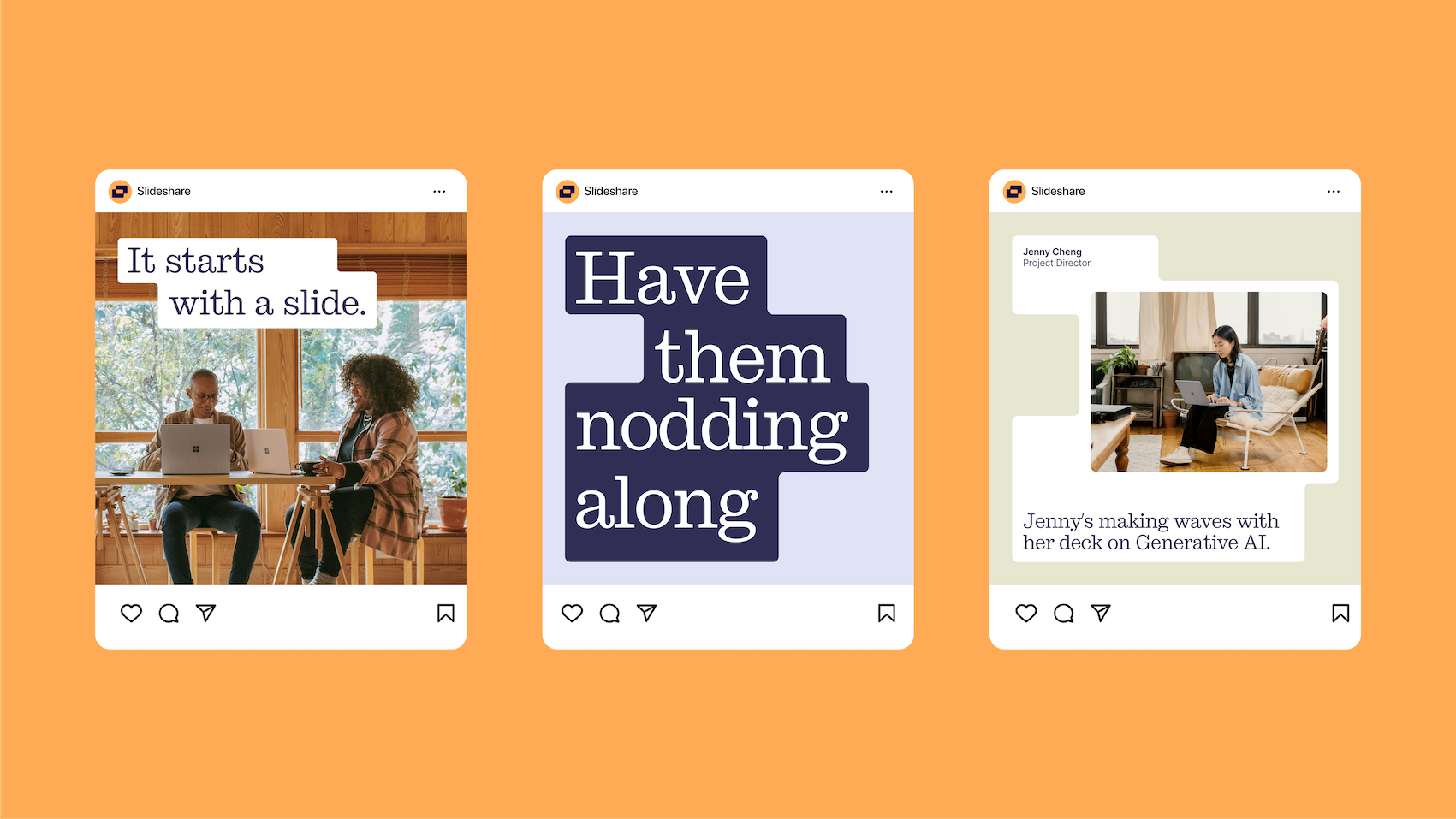
The system is designed to feel dynamic and flexible. A graphic device made of slide shapes conveys the flow of a presentation and the spread of ideas, with gradients and animation shifting between configurations. Light-hearted illustrations made from geometric and organic shapes represent product benefits and categories. Content from within Slideshare itself, such as the covers of shared presentations, is featured as another way to inspire users about the platform’s potential.
The tone of voice is optimistic and supportive, encouraging users with motivating prompts such as ‘This way to your best presentation yet’ and ‘Your ideas deserve a grand finale.’
Gemma Craven, VP brand marketing and comms, Scribd, Inc., said, “Slideshare has long been a destination for sharing presentations and ideas, but the brand no longer reflected the potential of the product. Working with Mother Design, we’ve developed a new identity that signals a fresh chapter for the platform – one that is clearer, more engaging and designed to inspire confidence in users. This rebrand reflects our ambitions for Slideshare as a place that empowers creators, connects global thinkers and reintroduces the platform to audiences worldwide.”
Jo Tulej, creative director, Mother Design, added, “The new Slideshare identity brings the brand firmly into the present with a distinctive, exciting design that encourages you to believe that fantastic presentations are easily within your reach. By balancing cues of authoritativeness, reassurance and expressiveness, the new look demonstrates that Slideshare understands the stress of making presentations, and that you’re in the absolute best place to kickstart your journey.
“Having now collaborated with Scribd, Inc. across three of its brands, we’ve developed a strong creative partnership and identities that balance distinctiveness with cohesion – positioning each brand as a leader in its own right.”
The refreshed Slideshare identity is launching globally across the platform, supported by additional marketing and social media activity.