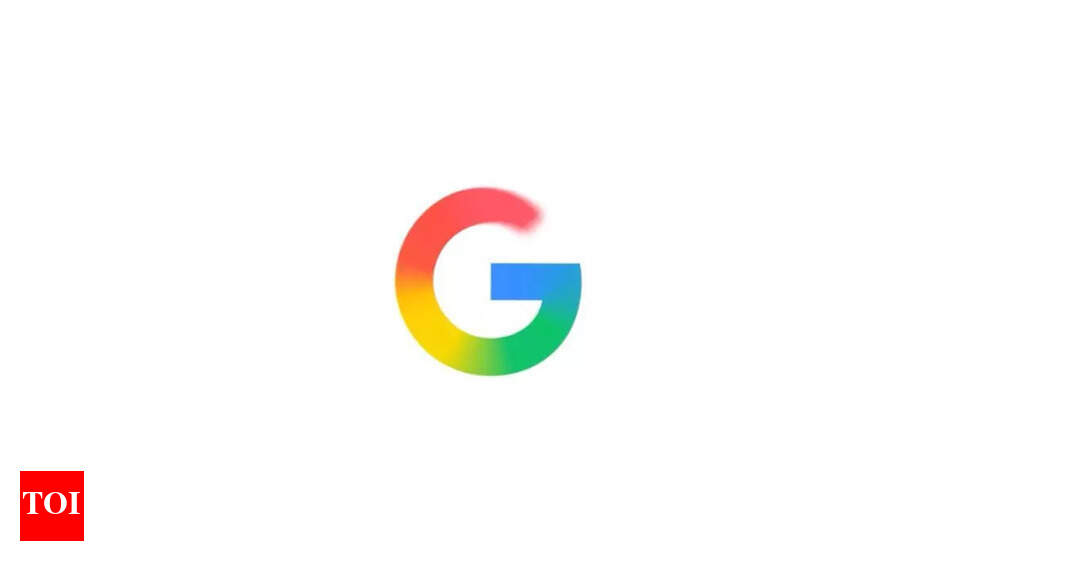
Google has rolled out a refresh version of its iconic ‘G’ logo across the company, making its first major update in a decade. The G logo now features a brighter, four-colour gradient design. It was first introduced in May this year for Google Search and will now serve as the company-wide icon representing both Google’s brand and the company itself. “Earlier this year, we introduced a brighter, four-color gradient “G” to represent Google Search. Now, we’re making it the company-wide “G” icon. The new “Google G” now represents all of Google — both our brand and the company — and visually reflects our evolution in the AI era,” Google said in a blog post.
Significance of Google’s new ‘G’ logo
The updated logo, the company said, stays “true to Google’s iconic four colors” with the brighter hues and gradient design symbolizing “the surge of AI-driven innovation and creative energy across our products and technology”.The design already appears in the Gemini spark since June. The tech giant said that it will be rolled out across more products, platforms, and services in the coming months.
Google celebrates 27th birthday
Last week, Google celebrated its 27th birthday on September 27, 2025, featuring a special doodle that brought back the company’s original 1998 logo design. The commemorative doodle showcases Google’s first-ever wordmark, transporting users back to the company’s humble beginnings in the late 1990s.Founded by Stanford PhD students Larry Page and Sergey Brin, Google has grown from a garage-based startup to a global technology powerhouse serving billions of users daily.While Google was officially incorporated on September 4, 1998, the company has celebrated its birthday on September 27 since the mid-2000s. This date commemorates a significant milestone in the growth of Google’s search index, symbolizing the platform’s rapid expansion.