Home Assistant is an incredibly powerful and versatile platform that puts you in control of your smart home. But all that power is only useful if you can easily access and manage it. By default, your dashboard is where you’ll find every control and operation status indicator you’ll need. Despite its feature-rich capabilities, the stock dashboard may feel restrictive if you’re looking for a personalized setup that goes beyond just the appearance. A dashboard is only as effective as the information it displays, and a cluttered or confusing layout can quickly become a source of frustration.
Thankfully, the Home Assistant community is brimming with creativity, and there are countless pre-built dashboards that you can adapt and customize to your own needs. Most custom dashboards are a combination of a gorgeous backdrop for an assortment of standard or custom cards, all of which you can tweak to suit your gadgets. You can find most of these custom cards and UI elements in the Home Assistant Community Store (HACS), and you may need to write code for the YAML file to define appearance and functionality. That said, I’ve found six custom dashboard designs truly inspiring, and some even feature a GUI for easier, no-code setups.
Related
5 things I wish I had known before using Home Assistant
Despite the steep learning curve, there are features to help you catch up quickly and rich community support to help with solutions.
5
Dwain’s Dashboard
The one that everyone recognizes
This dashboard design isn’t the newest on the block, but it has inspired several designs across the community. It’s worth noting that the original creator has announced they have stopped active development, but community-submitted pull requests will be merged and support for current Home Assistant versions should be possible as a result. This integration, available through HACS, automatically generates a dashboard based on your existing Home Assistant configuration. As long as you have your entities and devices organized into areas, Dwain’s Dashboard will do most of the work for you, creating a clean and intuitive interface with no YAML coding.
After restarting Home Assistant, you can add the Dwain’s Dashboard integration through the Devices & Services menu. From there, the dashboard will be available in your sidebar, and you can begin configuring it to your liking.
While the dashboard is automatically generated, you have the ability to edit the entire layout using a GUI. You can easily replace the default cards with custom ones, such as the popular Mushroom cards, using blueprints. This allows you to create a dashboard that is both functional and visually appealing. I like how this dash also has a dedicated weather page and support for creating more custom pages in the main navigation bar, should you feel so inclined.
Irrespective of your level of familiarity with Home Assistant, the Dwain’s Dashboard integration is a great starting point for your customization journey, even if you are an advanced user. The documentation and community forums are also great resources for getting help and inspiration for how to best utilize this foundation.
4
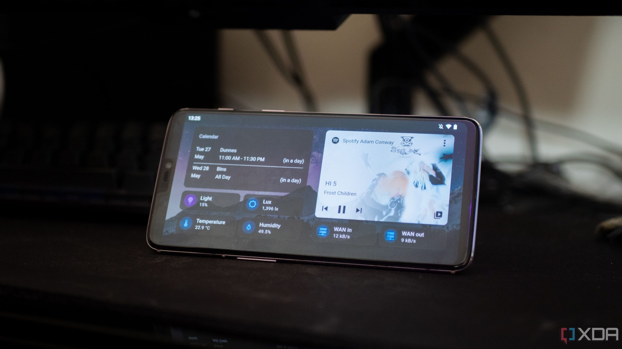
ElementZoom’s Mobile Dashboard
Who said good-looking setups are for desktop only?
For those who prioritize a sleek and modern mobile experience, ElementZoom’s Material Design 3-inspired dashboard is a true work of art. It builds upon Google’s established design philosophy, so the dashboard looks right at home if you’re using an Android device, complete with dynamic theming for accents that adapts seamlessly between light and dark modes.
The dashboard is built around a collection of custom cards and templates that work together to create a cohesive and intuitive user experience. The homepage provides a quick overview of important information, including real-time weather, critical alerts, and the status of your home’s security. Indoor and outdoor temperature readings cleverly integrate climate controls, and a hidden calendar is accessible with a simple swipe or tap. I must appreciate how most of the information is color-coded so you know exactly when a room is warmer than you want it to be. Rooms are color-coded based on their temperature, creating a “heat map” effect and lights are color-coded by type, so they look cohesive together.
Besides scaling correctly to fit a smartphone display, this dashboard design uses a tabbed interface efficiently to compartmentalize your smart home. Each tab is dedicated to a specific function—Currently Active provides a real-time overview of all active devices and automations, while Room Overview offers quick access to lighting, climate, and door/window status for each room. You also have the options of a simple toggle switch for lights and a Stats tab that shows you dynamic information from compatible sensors.
The GitHub page for this dashboard is still a work-in-progress since it is a new design, but it neatly lists out all the cards, graphing, and templating components you’ll need from HACS, so you can get started yourself. The creator has promised to include the YAML code shortly. At the time of writing, this dashboard theme is not available as a theme, but the creator is open to collaborators to make that happen.
3
LastBitofCoffee’s Bubble Card mobile dashboard
A powerful custom card is all you need
If you’ve been in the Home Assistant ecosystem for the past couple of years, you may have heard about the Bubble Card. It is a custom card ecosystem complete with its own setup interface and store for integrations and modules, and a truly unique pop-up effect for the pages known as bubbles. This dashboard design makes extensive use of this Bubble Card design.
The dashboard features a clean and modern design, with a focus on simplicity and ease of use. The main overview page uses Home Assistant’s sections layout to create a clean and organized grid of room cards. They are created with the Bubble Card’s Large with sub-buttons in a grid layout, providing quick access to the most important controls and information for each room. The pop-ups enabled by the custom card used in this dash layout make it easy to tuck additional information without cluttering up the primary interface. Tapping a button can trigger a pop-up card that slides up from the bottom of the screen, revealing a more detailed view with additional controls and charts. These pop-ups can have a semi-transparent background to accentuate the pop-up effect.
The Bubble Card itself is highly customizable, and /u/LastBitofCoffee has taken full advantage of this by creating their own Bubble Card modules to modify button and sub-button colors. The dashboard also uses charts extensively to visualize data and provide insights, like your home’s energy consumption. It could also incorporate ApexCharts and mini-graph-card to create a variety of charts, including a daily solar production vs. consumption chart and a daily power usage chart.
2
Weather dashboard
Purpose-built to perfection
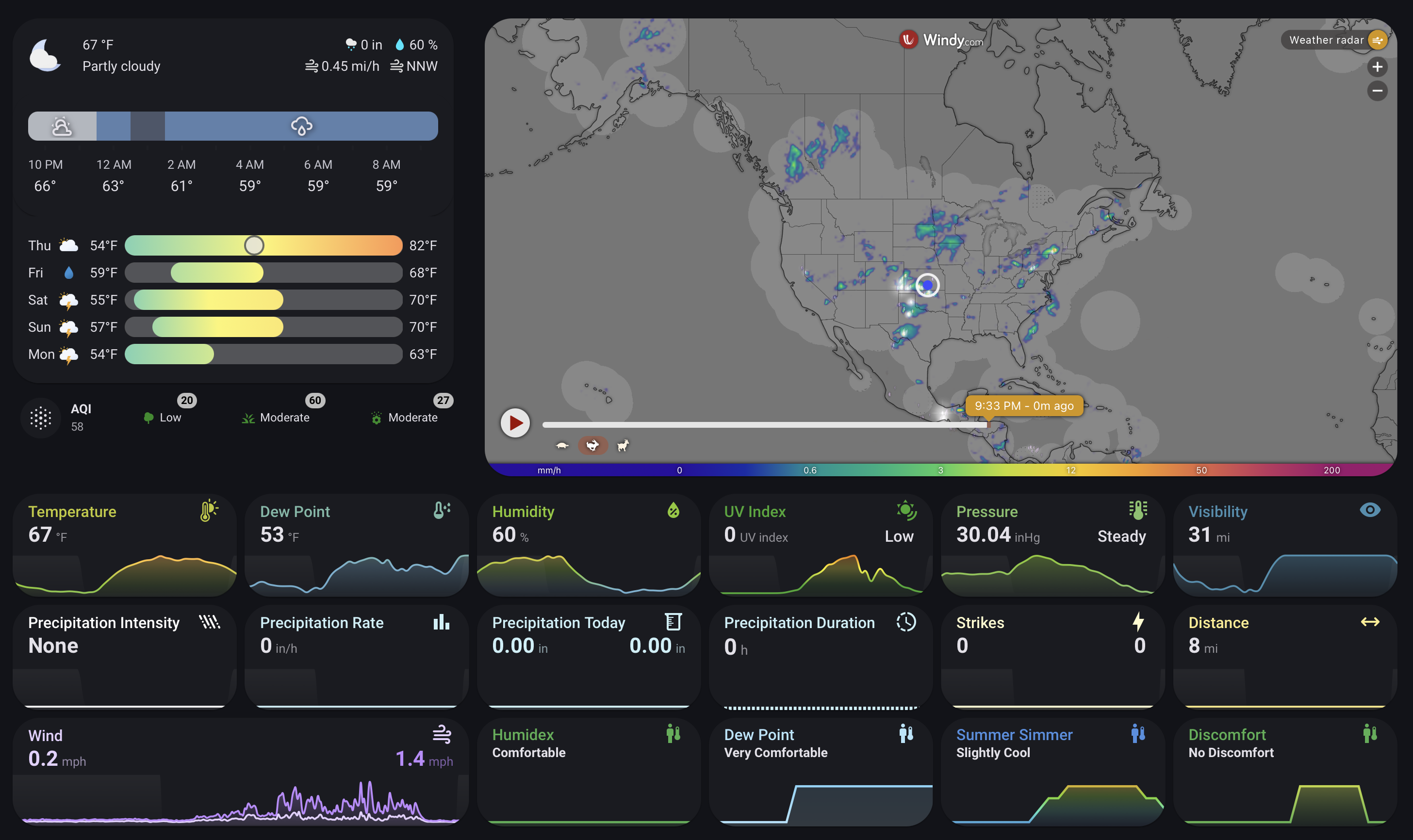
Source: /u/whiskea/Reddit
For many smart home enthusiasts, a detailed and accurate weather dashboard is an essential part of their day, hence deserving a prominent spot in their setup. This might be to prep for frequently inclement weather, or just to avoid stepping out when pollen and dust levels may trigger allergies. Irrespective of the reasoning, the Home Assistant community has curated several fantastic weather-tracking skins, but my favorite comes from /u/whiskea on Reddit.
The dashboard is built using a combination of horizontal-stack and vertical-stack-in-card to create a clean and organized layout. The top left corner of the dashboard features a clock-weather-card combined with a detailed daily forecast and wind information. An iframe card is used to embed a live weather map from a provider called Windy, supplying a dynamic and interactive view of current patterns. I appreciate how the layout uses the mini-graph-card liberally to display historical data for a variety of sensors, including temperature, humidity, and wind speed. The user can configure these graphs with animations and night shading for a clearer visual representation of the data.
For pollen, this dashboard pulls data from the Kleenex Pollen Radar, and the World Air Quality Index card for monitoring air quality. Interestingly, this dash also uses the same bubble-card that was the foundation of the previous dashboard, but this time to create pop-up cards and badges, such as the pollen level badges on the AQI card. All the other weather data for this dashboard comes from a Tempest weather station, using the WeatherFlow_Forecast integration. However, you could easily adapt the dashboard to use other sources. The card_mod integration is used for custom styling, so the overall appearance of the cards matches your personal preferences.
1
Floor plan dashboard
Realistic as it gets
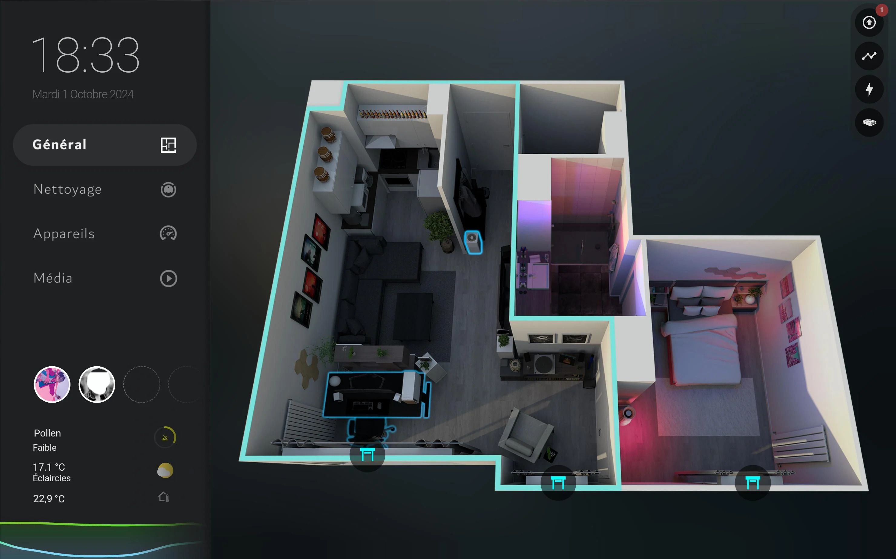
Source: /u/DevoliaEsp/Reddit
For some of us, a pictorial representation of the status of all the smart devices in our home conveys information most efficiently. By default, Home Assistant includes a card that takes a top-down view of your floor plan to show room-wise controls for lights, temperature, and other data readouts. However, it is 2025, and you don’t need an architecture major to design a dynamic and 3D view of your house for smarter monitoring. /u/DevoliaEsp’s Floor plan dashboard is a fantastic example of this, providing a clean and interactive interface for controlling their apartment.
The dashboard, which is used on a Samsung Tablet, Galaxy Fold 5, and desktop, shows a global view of the apartment, with devices highlighted in blue when they are on. Tapping on a device brings up a control pop-up, allowing you to adjust settings and toggle power. You can also tap on a room to control light scenes and climate for that specific area. The dashboard renders light colors in real-time, accurately reflecting the current state of the installed smart lights. It uses three stacked overlays—one each for red, white, and warm light, with filters applied to adjust the color. Moreover, presence detection is used to outline a room, chair, or bed to indicate where people are in the apartment.
I love the attention to detail in this dashboard, which shines through with small bits like the custom TV remote card with shortcuts for video sources, and a pop-up that allows the user to switch their PC’s video output between their desktop and TV. The most important element, the house visualization in the background, is made using a free interior design application called Sweet Home 3D. The pop-up windows are created using Browser_mod on HACS since it nests any card into a pop-up window when tapped. Lastly, the creator revealed that dynamic outlines used for presence detection and visualization are implemented with a pre-rendered blue glow overlay linked to the motion sensor’s status. If you’re looking for a conversation starter dashboard that instantly wows even those who don’t understand Home Assistant, this ought to be your top pick despite the initial legwork of mapping out your floor plan in Sweet Home 3D.
An investment that’s worth your while
Depending on how frequently you consult your Home Assistant dashboard, investing a weekend in setting up one of these amazing layouts and customizing it to suit your requirements might be worthwhile in the long term. Custom Home Assistant dashboards may be the final garnish that you need to perfect a beautiful home automation setup that looks as good as it works. Together with guidance from a resourceful community and an iota of patience, you can combine a few custom cards and transform your dashboard from a simple control panel into a stunning and unique control center.