Following Keep (which we’re now seeing go live on more devices), Google Calendar for Android is beginning to see its Material 3 Expressive redesign go live.
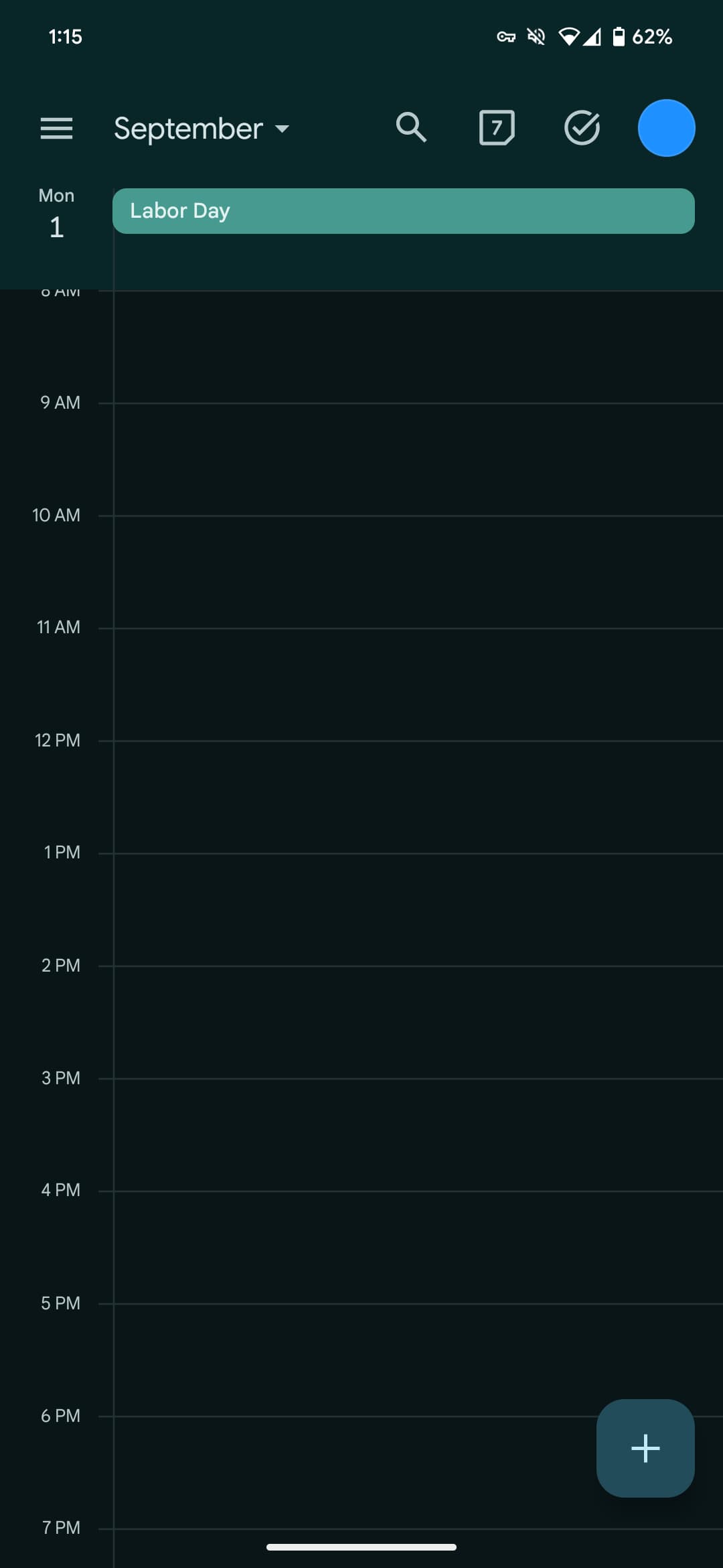
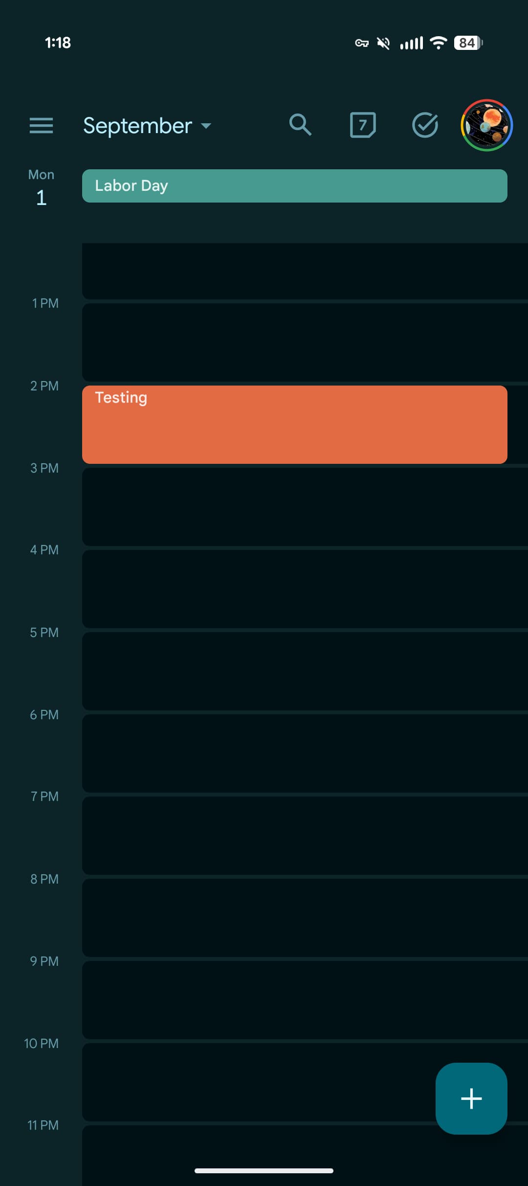
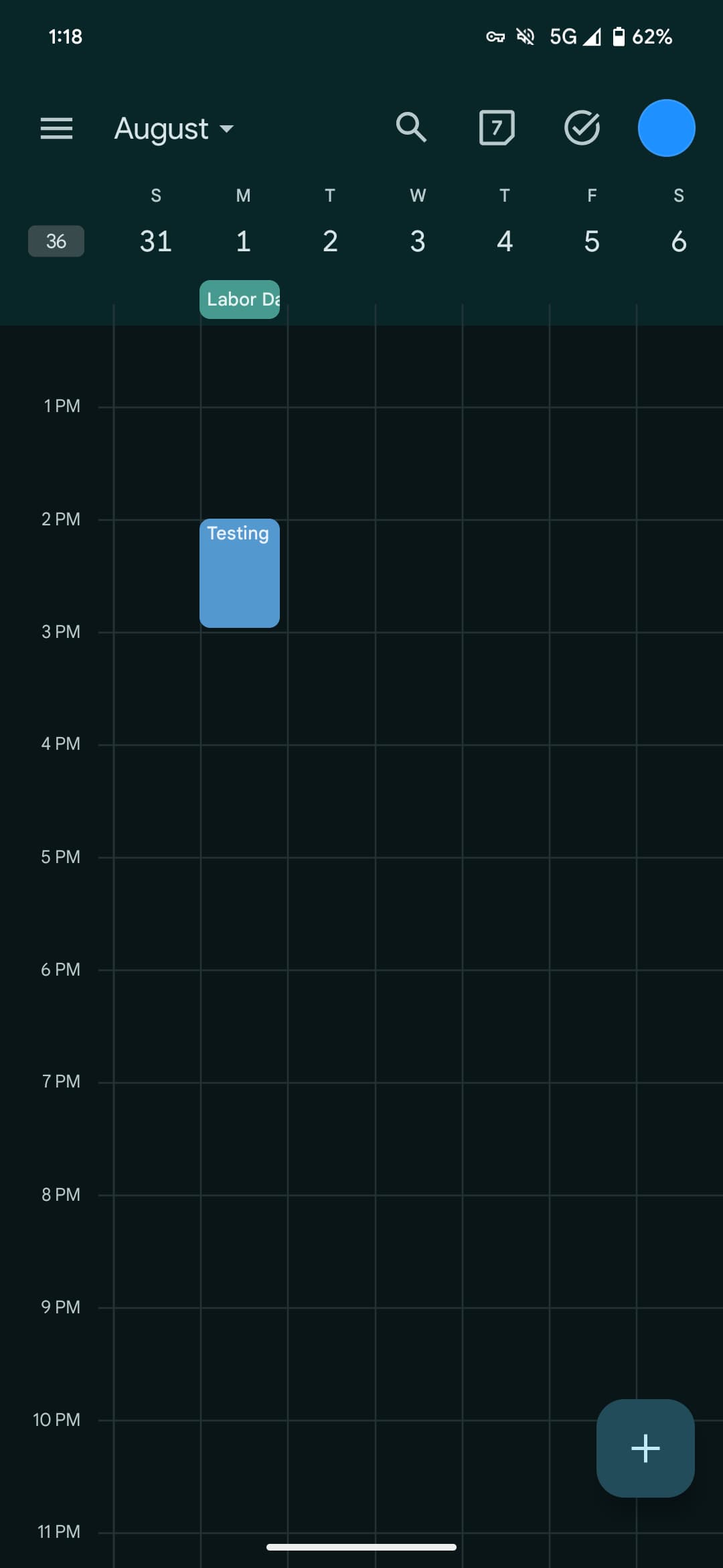
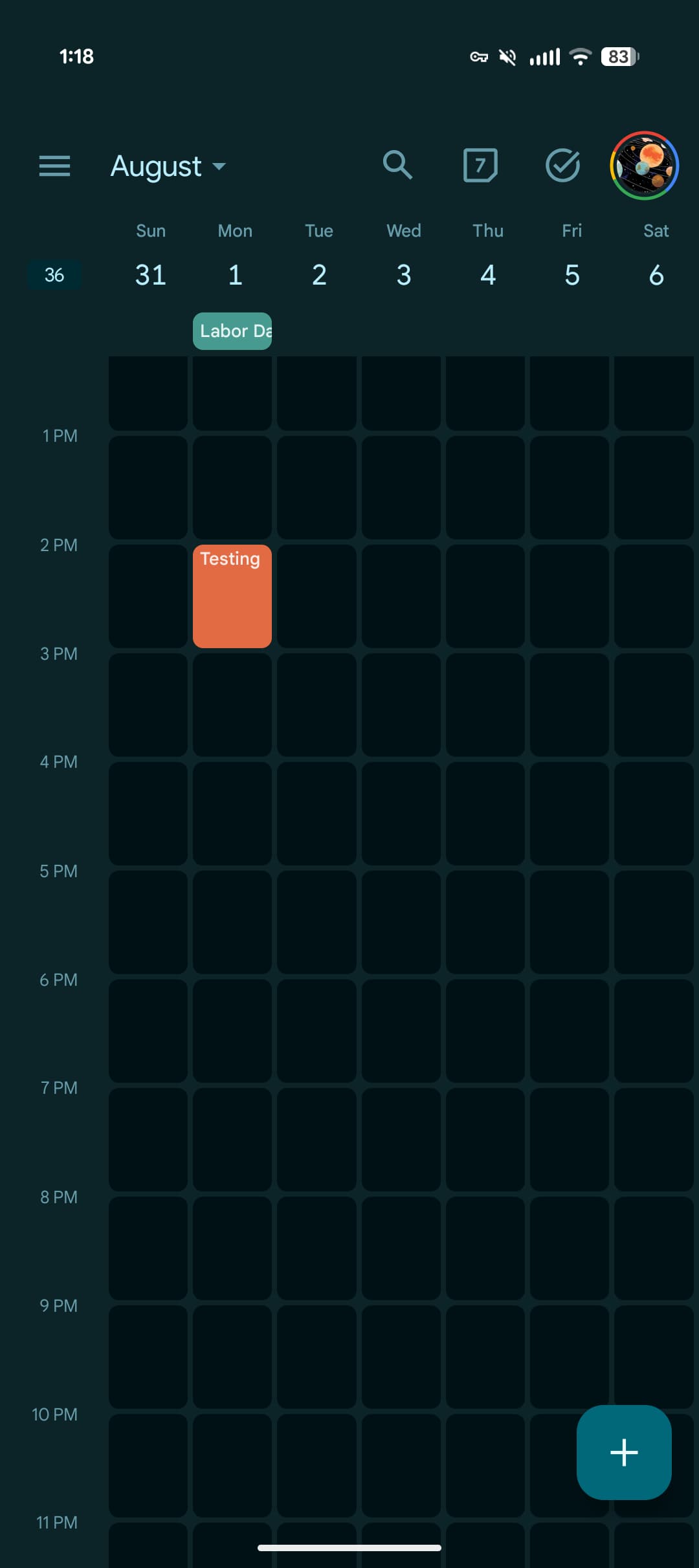
This redesign places time (hour and day) slots in containers with a solid background layer in the primary shade of Dynamic Color. Compared to the faint lines used previously, this might help with visibility.
Old vs. new
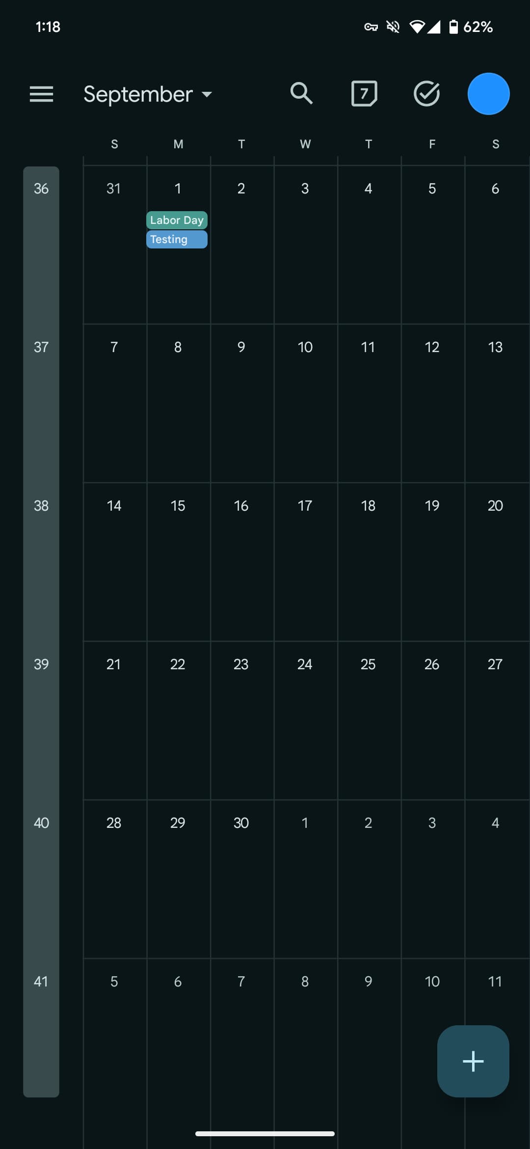
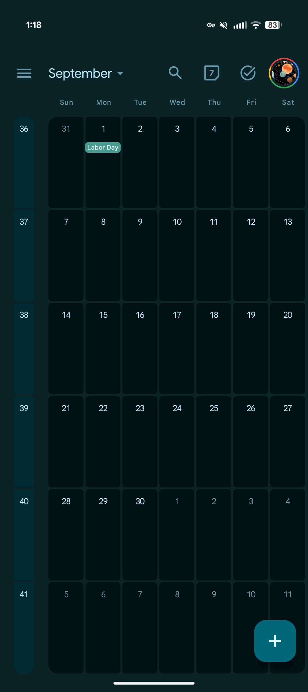
In the Month view, days are physically separated from each other with the corners rounded, while longer day abbreviations are now used. It looks like a chocolate bar. To my eye, this approach does look more modern, but it feels heavier to browse.
This design uses much more Dynamic Color than before, while the Week view gets a similar treatment.
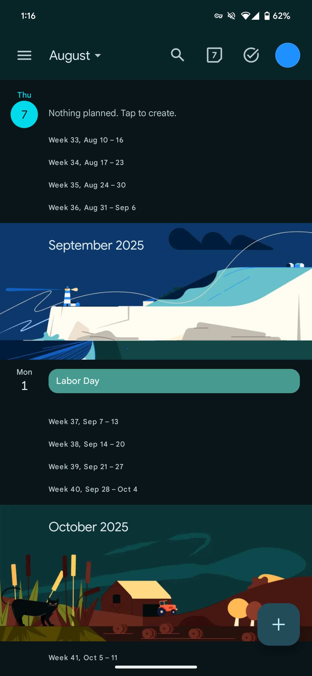
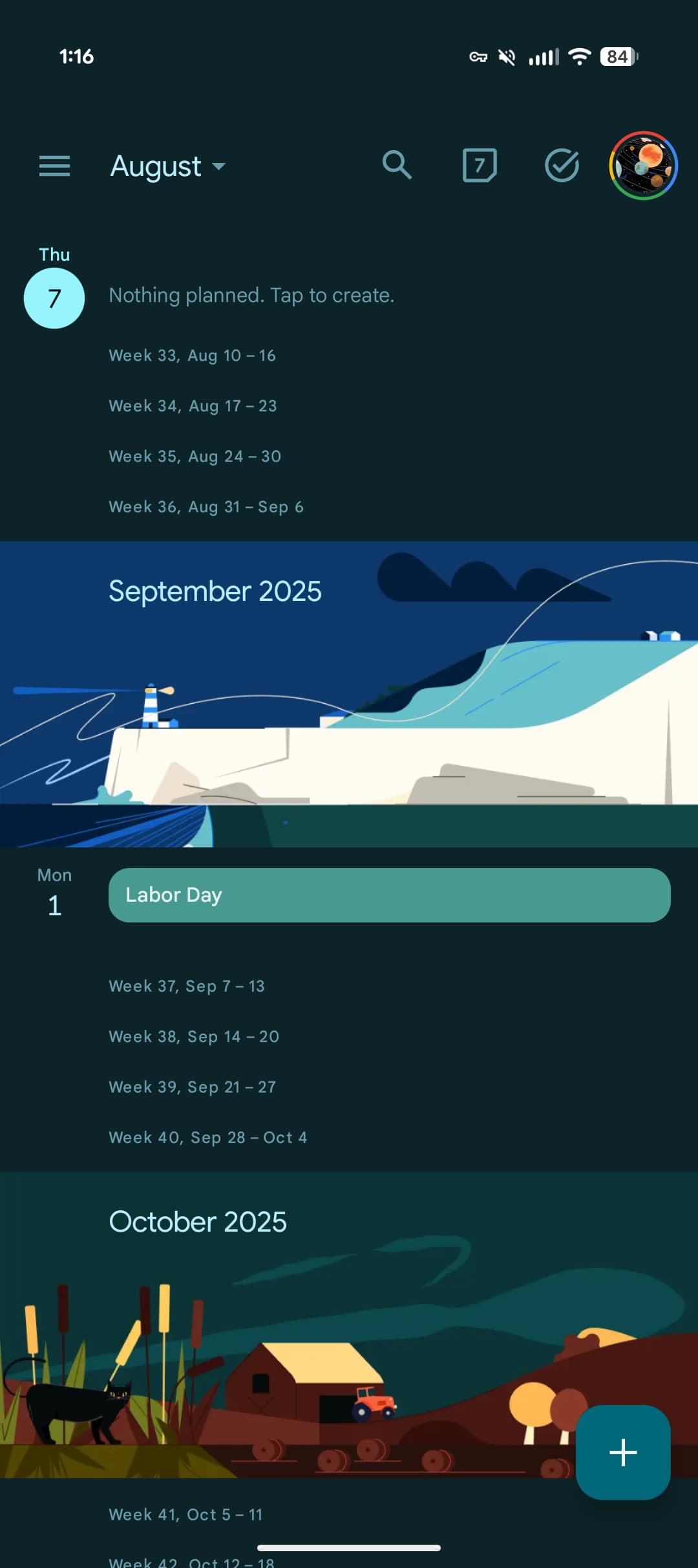
The Agenda view gets that background update, while other views — events, creation interface, settings, etc. — today have not been updated. As such, this is a pretty surface-level update focused on bringing M3 Expressive to the overview screens.
We’re seeing this Google Calendar Material 3 Expressive redesign with a server-side update to version 2025.30.x. It’s not yet widely rolled out.
More on Google Calendar:
FTC: We use income earning auto affiliate links. More.