Obesity is a complex disease that not only affects an individual’s appearance but also has multifaceted negative impacts on physical health, including cardiovascular diseases, type 2 diabetes, hypertension, fatty liver disease, and certain types of cancer1. Additionally, obesity contributes to psychological distress, increasing the risk of depression and anxiety, and imposes a significant economic burden on public health systems2,3. Given the rising prevalence of obesity, understanding how consumers estimate food calories and make dietary choices is essential for both public health and marketing strategies. Previous research has strongly linked obesity with the underestimation of food calories, highlighting the need for interventions that help consumers make more informed choices4,5,6.
Food choices are influenced by various factors, including economic conditions, sociocultural influences, psychological aspects, marketing strategies, and food packaging design7,8,9. Among these, food packaging color plays a crucial role in shaping consumer perceptions and decision-making. Colors can act as implicit cues that influence caloric estimations, thereby affecting consumers’ food selections and dietary behaviors10. As a key element of sensory marketing, packaging color has the potential to nudge consumers toward healthier choices, making it a valuable tool for both businesses and policymakers.
Despite extensive research on food packaging and consumer behavior, there remains a significant research gap regarding how color influences calorie estimation and the mediating role of perceived healthiness in this relationship. Furthermore, most existing studies rely on self-reported surveys or controlled laboratory experiments, which may lack ecological validity. This study uses virtual reality technology to investigate how food packaging color (red vs. green) influences consumers’ calorie estimations and whether perceived healthiness mediates this effect. By uncovering these mechanisms, this research provides insights that are relevant not only to public health interventions but also to food industry marketing strategies and regulatory policies. Specifically, these findings can inform front-of-pack labeling regulations and guide food manufacturers in designing health-oriented packaging that encourages better consumer choices11,12. Given the increasing emphasis on behavioral nudges in public policy, understanding the impact of color-coded cues on food perception can help develop more effective marketing and regulatory frameworks, ultimately contributing to obesity prevention and healthier consumer behavior.
Color, caloric estimation, and perceived healthiness
Color is one of the most immediate and influential visual cues in food packaging, shaping consumer perceptions and decision-making processes. Previous research has highlighted the significant impact of front-of-pack (FOP) visual cues on consumer food choices and eating behaviors, emphasizing the role of packaging color as a critical element in shaping dietary decisions13. Consumers frequently rely on packaging color to infer the healthiness and caloric content of food rather than consulting detailed nutritional labels5,14,15. However, the specific mechanisms by which color affects food health perception and caloric estimation remain unclear, particularly regarding the mediating role of perceived healthiness in this relationship.
Food packaging color plays a crucial role in shaping consumer perceptions of healthiness. Research has shown that color-coded packaging influences consumer expectations about food attributes, often more strongly than textual nutritional information16. Green is typically associated with health, natural ingredients, and lower calories, whereas red is often linked to high-calorie, indulgent, and less healthy foods17,18. These associations arise not only from everyday experiences but also from strategic marketing practices. Many health-oriented products use green packaging to emphasize their nutritional benefits, while high-calorie snacks or fast foods often employ red to attract attention and stimulate impulse purchases19,20. Moreover, color influences sensory expectations, with red enhancing perceptions of richness and indulgence, whereas green can make food seem healthier but potentially less flavorful21. Recent research has expanded from examining singular color effects to investigating the interactions between color and other visual cues, such as shape and labeling22. Recent research by Hallez et al. (2023) further supports the significant role of packaging color in shaping consumer perceptions of healthiness, sustainability, and taste among young consumers. Their study demonstrates that color, in interaction with packaging claims, influences product evaluations, with findings closely aligning with the current research on color-driven health perceptions. This highlights the importance of considering interactive effects between color and other visual or textual cues in food packaging design, an area warranting further exploration in the context of calorie estimation23. For example, Grunert & Wills (2007) found that consumers prefer simplified front-of-pack labeling formats but differ in their reliance on color-based health cues depending on the product category and context24. However, the precise mechanisms by which color influences food health perception require further empirical validation.
Studies suggest that consumer perceptions of a food product’s healthiness significantly influence their caloric judgments25. Prior research indicates that consumers tend to overestimate the caloric content of foods they perceive as unhealthy while underestimating those they deem healthy25. This phenomenon has been observed in various contexts; for example, when consumers compare two identical yogurt products labeled as “low-fat” and “full-fat,” they consistently judge the full-fat yogurt as having higher calories, despite both products containing the same caloric content26. Similarly, fast food consumers—especially those frequenting health-branded chains such as Subway—tend to underestimate the caloric content of meals, leading to higher caloric intake27. In one study, participants were asked to evaluate the healthiness and caloric content of eight different foods. The results showed that foods perceived as healthy or beneficial for weight loss were typically underestimated in caloric content, whereas foods perceived as unhealthy or detrimental to weight loss were overestimated17. Furthermore, the health-oriented branding of a restaurant can lead consumers to underestimate the caloric content of its meals, resulting in increased caloric intake14. These findings indicate that consumers do not estimate calorie content directly based on the food itself but rather indirectly through their judgments of healthiness. Thus, food packaging color may first influence health perception, which in turn affects caloric estimation19,20. While perceived healthiness has been widely studied in consumer decision-making, its specific mediating role in the color–caloric estimation relationship remains underexplored.
Overall, food packaging color may influence caloric estimation by first shaping consumers’ perceptions of healthiness. However, most existing research has focused on color’s impact on food choice and consumption behavior, with limited direct investigation into how color affects caloric estimation22. Additionally, prior studies have relied primarily on self-reported surveys or controlled laboratory experiments, which may lack ecological validity. With the development of Virtual Reality (VR) technology, this research integrates VR to further enrich and develop its application in consumer behavior studies. Compared to traditional research methodologies, VR technology offers low costs, reusability of experimental scenarios, and immersive experiences that more accurately replicate real-world environments28, thereby holding significant advantages in consumer research. Therefore, this experiment leverages VR technology to perform experimental manipulations, aiming to explore the underlying mechanisms more profoundly.
Theoretical framework: association theory and embodied cognition theory
Sensory marketing research frequently utilizes Association Theory and Embodied Cognition Theory to explain how sensory cues influence consumer perceptions and behaviors. These theories provide a foundation for understanding how color cues (red vs. green) affect consumers’ calorie estimations through their perceptions of healthiness.
Association Theory posits that repeated co-occurrences of stimuli lead to learned associations, allowing consumers to anticipate one event based on the presence of another29. In food packaging, red and green are commonly used in health-related messaging, shaping consumer expectations. Red is often associated with cautionary signals, energy, and intensity, while green is frequently linked to health, natural ingredients, and lower-calorie options. These learned associations influence consumer judgments, leading to expectations that green-packaged foods are healthier and lower in calories, whereas red-packaged foods may be perceived as less healthy and higher in calories. This heuristic processing may guide consumer decision-making, particularly in contexts where detailed nutritional information is not immediately considered.
Embodied Cognition Theory, in contrast, suggests that cognitive processes are deeply rooted in bodily interactions with the environment, meaning that sensory experiences—such as visual exposure to color—can directly shape cognitive evaluations and perceptions. Research has demonstrated that bodily perceptions significantly impact consumer experiences; for instance, tactile sensations influence service perception, with soft textures enhancing tolerance for service failures30, while rough textures evoke empathy and generosity31. Similarly, product shape affects size perception, as consumers tend to perceive round pizzas as smaller than square pizzas of the same surface area32. In the context of food perception, color can elicit immediate cognitive and affective responses, influencing how consumers assess healthiness and caloric content. Red may enhance perceptions of higher energy content, whereas green may reinforce associations with health and lower caloric density.
By integrating Association Theory and Embodied Cognition Theory, this study examines how packaging color influences consumers’ calorie estimations through their perceptions of healthiness, providing insight into the cognitive mechanisms underlying food-related judgments.
Research objectives
This study aims to investigate how food packaging color (red vs. green) influences consumers’ calorie estimations and whether perceived healthiness mediates this effect. While previous research has demonstrated that color cues shape consumer perceptions, the underlying cognitive mechanisms—particularly the mediating role of perceived healthiness—remain underexplored. Drawing on Association Theory and Embodied Cognition Theory, this research seeks to clarify how learned associations (e.g., red with unhealthiness and green with health) and direct sensory experiences influence food-related judgments.
Specifically, this study examines whether red packaging leads to higher calorie estimations and green packaging leads to lower ones, particularly in the context of unhealthy foods. Since consumers often rely on heuristic cues, color may serve as a visual shortcut for evaluating a product’s healthiness, subsequently influencing calorie estimation. However, if the association between color and healthiness is disrupted—such as through an experimental manipulation where color is framed as unrelated to health—the effect of color on calorie estimation should diminish. Additionally, this research explores whether altering the color-health association affects consumers’ food choices, potentially leading to an increase in food selection when color no longer serves as a heuristic signal for health.
To address these research objectives, the following hypotheses are proposed:
H1: For unhealthy foods, red packaging will increase consumer calorie estimations compared to green packaging.
H2: Perceived healthiness mediates the effect of packaging color on calorie estimation of unhealthy foods.
H3: For unhealthy foods, the association of red with unhealthiness will lead to higher calorie estimations of foods in red packaging. After manipulating “color unrelated to health,” the impact of color on calorie estimation will disappear in the manipulated group.
H4: Compared to the control group, the number of food choices will increase in the manipulated group where “color is unrelated to health.”
By testing these hypotheses, this study seeks to provide both theoretical contributions to sensory marketing and practical implications for food packaging design and public health communication. Understanding how color influences calorie estimation through perceived healthiness can inform strategies for promoting healthier eating behaviors and improving consumer awareness of nutritional content.
Study 1: the impact of food packaging color on calorie Estimation
Study 1 employs a single-factor between-subjects design, with the independent variable being packaging color, divided into two levels: red and green. The dependent variable is the numerical estimation of calories, and the mediating variable is the perceived level of healthiness.
Experimental objectives and hypotheses
The purpose of Study 1 is to explore the impact of food packaging color on calorie estimation and to examine the mediating mechanism of perceived healthiness. The following hypotheses are proposed for this experiment:
H1: For unhealthy foods, red packaging will increase calorie estimations compared to green packaging.
H2: Perceived healthiness mediates the effect of packaging color on calorie estimation for unhealthy foods.
Participants
Participants were recruited through the distribution of a survey link on social media platforms using Questionnaire Star. A total of 159 respondents completed the survey, including 67 males and 92 females, with an age range of 18–32 years (M = 23.55, SD = 2.46). The studies involving human participants were reviewed and approved by Fudan University Ethics Committee (FDU-SSDPP-IRB-2024-2-103). They were performed by the ethical standards laid down in the 1964 Declaration of Helsinki and its later amendments. All participants in the study provided informed consent, which involves the consent to publish their data.
Experimental materials
Food packaging images
Following previous studies, the products were categorized into two broad categories: healthy and unhealthy, with a total of six products selected (see Appendix 1).
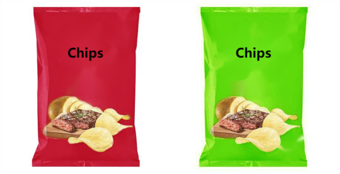
This design allows for a controlled and focused examination of the influence of color on perceived calorie content, leveraging both visual stimuli and participant self-report measures to gather data on perception dynamics influenced by packaging color (see Fig. 1).
Example of product images (red on the left and green on the right).
Healthy categories include yogurt, nuts, and fruit cereal, while unhealthy categories include potato chips, chocolate, and milk tea instant beverages. These six products were processed through Photoshop, keeping all aspects identical except for the packaging color. To maintain consistency, the RGB color values for red are: Red: 213; Green: 32; Blue: 53. The RGB color values for green are: Red: 123; Green: 225; Blue: 47.
To exclude other possible explanations such as taste appeal and attractiveness of packaging, participants were required to evaluate the taste appeal of the food, the attractiveness of the packaging, and their perception of the healthiness associated with the colors. The taste appeal was rated on a scale from 1 (not tasty at all) to 7 (very tasty). The attractiveness of the packaging was rated from 1 (not attractive at all) to 7 (very attractive).
Results (see Table 1) indicate that participants did not perceive a significant difference in taste between red and green packaging (M_red = 4.81, SD_red = 1.45; M_green = 4.80, SD_green = 1.47; t(475) = 0.05, p = 0.96), thus excluding taste appeal as another possible explanation.
Additionally, as shown in Table 2, there is no significant difference in the perceived attractiveness of the packaging between the red and green options (M_red = 4.16, SD_red = 1.50; M_green = 4.13, SD_green = 1.48; t(475) = 0.23, p = 0.82). Therefore, the potential explanation based on the attractiveness of the packaging is also ruled out.
Caloric Estimation measurement
In this experiment, participants were asked to estimate the caloric content of the displayed foods, using the calorie content of walnuts as a reference. Specifically, participants were informed: “The calorie content of walnuts we commonly consume is 574 cal per 100 g. Please estimate the calorie content per 100 g for the food items shown in the picture above.”
Measurement of perceived healthiness
Perceived healthiness refers to consumers’ immediate judgment on the healthiness of a food item. This was measured using two items: perceived healthiness of the food (1 = very unhealthy, 7 = very healthy) and perceived increase in body fat after consuming the food (1 = very little, 7 = very much). The scores for perceived increase in body fat were reverse-scored and then averaged with the perceived healthiness score to construct a healthiness variable for the food (α = 0.787), where higher scores indicate greater perceived healthiness.
Experimental procedure
Study 1 employed a questionnaire method. Participants were instructed: “Hello: Thank you very much for your participation. We are currently conducting a study on food packaging. Please fill out the questionnaire on your phone or computer based on your actual situation, which will take about 5 minutes of your time. We solemnly promise that all data is anonymous and will only be used for this research.” Participants were first required to fill out personal information, then view product images presented in the questionnaire, estimate the calorie content of the products based on the reference calorie information provided, and answer questions about their perceived healthiness of the food. Subsequently, participants evaluated the taste of the food (1 = not tasty at all, 7 = very tasty), the attractiveness of the packaging (1 = not attractive at all, 7 = very attractive), and the healthiness perception related to the color (measured by the item “Color is related to people’s physical and mental health” (1 = strongly disagree, 7 = strongly agree)). To avoid practice and fatigue effects, the order of image presentation was balanced as “unhealthy-healthy-unhealthy.”
The study distributed 159 questionnaires, retrieved 159 effective responses, and then processed the data and performed statistical analysis.