- Scientists Discover Unusual Long-Legged Ancient Crocodile From 200 Million Years Ago SciTechDaily
- Ancient crocodile species named Jones after teacher from Cardigan BBC
- Scientists Identify New Crocodile Ancestor That Ran Like a Greyhound Across…
Category: 7. Science
-
Scientists Discover Unusual Long-Legged Ancient Crocodile From 200 Million Years Ago – SciTechDaily
-
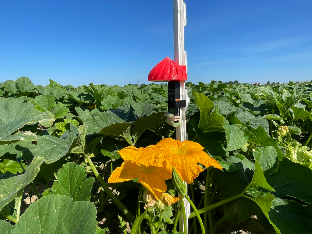
An Open-Source AI Tool for Listening to Pollinators
Buzzdetect, a new open‑source AI tool, uses simple microphones and machine learning to continuously detect pollinator activity. A new study shows how the tool can offer researchers and growers a low‑cost way to “listen” for bees in real… Continue Reading
-

Direct Genome-Scale Mapping of Endonuclease Activity of the Human LINE-1 ORF2p Endonuclease
Nabsys and the Research Lab of Dr. Martin Taylor, Brown University, Present Data Using the OhmX™ Platform at AGBT 2026
PROVIDENCE, R.I., Feb. 24, 2026 /PRNewswire/ — Nabsys 2.0,…
Continue Reading
-
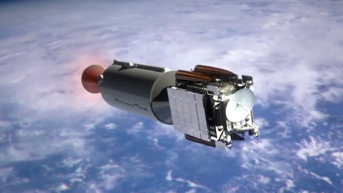
SpaceX Triggered a Lithium Plume in the Atmosphere, Study Confirms
A new study of Earth’s upper atmosphere has discovered spikes in lithium ion levels following the return of a Falcon 9 rocket upper stage, which broke up on reentry. With SpaceX planning to rapidly increase its number of orbiting satellites by
Continue Reading
-
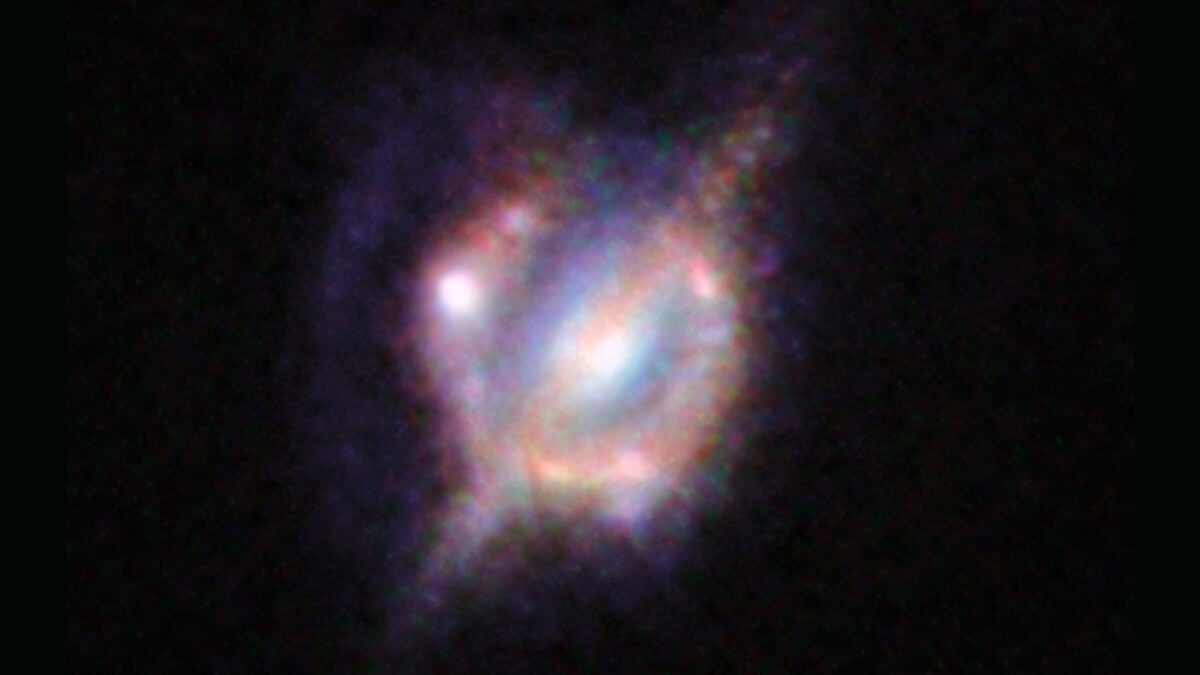
Meet the Gigamaser—the Brightest Microwave Laser Ever Spotted in Deep Space
Space is full of odd light sources astronomers don’t quite understand, like double supernovas, weird blue flashes, random Venn diagrams, and more. And just when we thought we’d seen it all, there’s a new addition to the…
Continue Reading
-

50 year quest ends with creation of silicon aromatic once thought impossible
Major scientific advances often require patience, and this discovery is a prime example. After nearly 50 years of theory and repeated failed attempts by research groups around the world, David Scheschkewitz, Professor of General and Inorganic…
Continue Reading
-
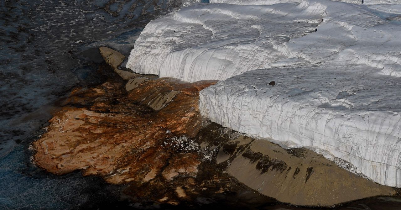
The Last Mystery of Antarctica’s ‘Blood Falls’ Has Finally Been Solved
There is a corner of Antarctica that looks like something out of a David Cronenberg movie. It’s located in the dry valleys of McMurdo, an immense frozen desert where, periodically, a jet of crimson liquid suddenly gushes from the dazzling white…
Continue Reading
-
CINEMA mission will explore auroras and Earth's mysterious magnetotail – Phys.org
- CINEMA mission will explore auroras and Earth’s mysterious magnetotail Phys.org
- NASA Fires Twin Rockets to “CT Scan” the Northern Lights and Map Hidden Auroral Currents The Debrief
- OTD in space – February 17: NASA launches 5 THEMIS…
Continue Reading
-
The Legal Void of the Asteroid Gold Rush
Asteroid mining companies are finally getting off the ground, and that is raising some concerns about the impact those activities will have on the space environment. A new paper published in Acta Astronautica from Anna Marie Brenna of…
Continue Reading
-
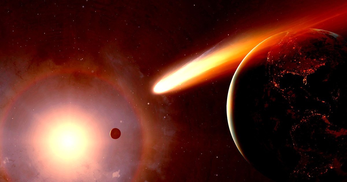
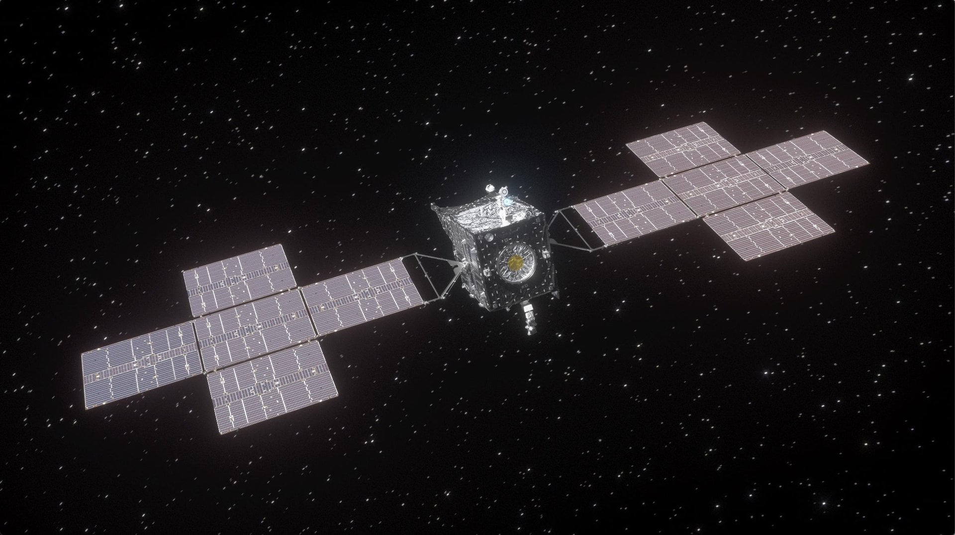
Daring Space Mission Would Catch Up With 3I/ATLAS and Intercept It
Interstellar object 3I/ATLAS provided scientists with an exceptionally rare opportunity to study the nature of other planetary systems beyond our own. It was first discovered in July of last year, heading straight past the Sun and making its
Continue Reading